I love the colors Katelynd chose for this quilt.
Tuesday, 29 September 2015
Simplicity
I'm always amazed at how adaptable this Simplicity pattern can be. I've quilted it now several times, and each quilt is different.
Monday, 28 September 2015
Yellow Brick Road, in blue, with dragonflies
Marilyn brought over this Yellow Brick Road quilt to be quilted, and it also has dragonflies in the fabric, and the dragonfly pantograph was still on the table, so it got quilted with dragonflies as well.
The dragonfly fabric is the tan fabric above, and it's also one of the border fabrics, so that was a pretty good hint that dragonflies would be appropriate on this quilt.
I vividly remember a nightmare about grasshoppers as a kid, so I wouldn't put insects on a quilt unless I know they're appropriate, and if there's this much dragonfly fabric in the quilt, I know it will be OK.
I love all the blue in this quilt.
Sunday, 27 September 2015
Dragonflies
Ethel pieced this beautiful quilt for her very lucky Granddaughter.
I just love the optical illusion of the circles in this quilt.
The feature fabric has dragonflies, and I was told the recipient loves dragonflies, so I quilted this quilt with dragonflies. It's a lovely panto. I don't use pantographs very often, but sometimes, its better than freehand quilting.
and the backing was a lovely fireside fleece, nice and cosy.
Thursday, 24 September 2015
Laurel Burch Quilt
Nancy made this cute little quilt for her Grand-Niece, and was just recently able to deliver it in person. She's posted a photo of it 'in use' by the recipient, so I know it's safe to share here now :)
I used the fabric for my quilting design inspiration- I wanted to emphasize those hearts, an appropriate theme for a quilt from a Great-Aunt, so I outline quilted around the hearts.
The minkee backing is reading black here, but I if I recall correctly it was a deep purple.
The photo I saw sure made it look like it was a happy little girl on her new quilt!
Monday, 21 September 2015
Car Warmer
This is Noreen's lovely batik quilt, and I'm pretty sure that the name of the pattern is Car Warmer. The pattern came from Rumpled Quilt Skins in Okotoks.
I want to talk about the thread and quilting design choices I made. If you're not so interested in that, have a look at the lovely photos and you don't have to read :)
I am lucky enough to be part of a fantastic Longarm Quilters group here in Calgary, and at our last meeting, one of the quilters was asking for advice on choosing designs, and so it is with her (and other quilters with similar questions) in mind that I write this post. She had brought a top to show us, where she hadn't liked the quilting design and picked it out. We could see from the needle holes in the top, that it had been an OK design for the quilt---and what I didn't think of until after was that perhaps it was the thread choice that was wrong.
So, I'll start with my thread choice on this quilt.
Both of these spools of omni looked good on the quilt and across a good fabric selection. I started stitching with the darker of the two, because how can you go wrong with a color like Milk Chocolate? Using your actual thread choice to baste gives a great idea of if you'll like that thread or not, I've changed threads after basting before.....but I liked the way it looked on the border fabric.
And then I tested my tensions---and had a look at the backside, and didn't care for this thread on the backing. I think a quilt needs to look good on both sides--and so I decided to change to the lighter Maple--also yummy, also looking great across the top, and now looking good on the backing as well. These next two photos show both threads---the basting line across the top and side is the Milk Chocolate, the stitching is the Maple.
and on the backing you can see the difference--both threads are stitched in the same area, but the darker thread looks harsh on the back and would be very dominant, rather than adding texture.
So, I changed to the Maple thread (these threads are both Omni).
I can usually find a thread that looks good across a whole quilt, very rarely there is one fabric on a quilt that just won't play with the same thread as the rest, and so I quilt the rest of the quilt and then come back with a different color thread and catch that one fabric where ever it shows up. So, don't be afraid to do that either, if you have to.
Now, it was time to decide the design. The first bit of information to consider is who is the quilt for, and how will it be used? I was told that Noreen was going to use this quilt for her bed. OK then, it might be worth doing a light custom quilting here, to highlight and accentuate the accurate piecing.
I spent a few minutes with my plexi-glass board, drawing and trying to sketch out a continuous light custom design, but I didn't find anything I was happy with. So, then I moved on to consider edge to edge designs. I haven't met Noreen yet, (her DIL drops off and picks up her quilts) so I don't know much about her, aside from the fact that she has VERY cute grandchildren. So, what does the quilt say to me?? (or, I look at the fabrics and piecing). There's nothing floral in these fabrics. Neither the fabrics nor the piecing are traditional quilting. The quilt doesn't call for feathers (some quilts really do just ask me to be feathered, this one did not). The piecing is all very straight and angular, so perhaps some curves, but those points!! I liked them. And thus, I chose what I call my 'greenstone fishing hook' (because it reminds me of Maori Greenstone (Jade) fish hook pendants). Curvy and pointy both.
I hope Noreen likes it. Her DIL certainly did, and was talking about keeping it. So, Noreen, if you didn't get your quilt back, I might have a good idea of where it is :P
Friday, 31 July 2015
Prairie Crossroads and Heritage Park
Prairie Crossroads was my contribution to the Calgary Longarm Quilters group submission at Heritage Park this past May.
The pattern we used was Crossroads, by Allison Spence. This is the third time I've made this pattern, the first two can be seen Purple Crossroads and Grandma's Crossroads.
The block looks like this
and if you looked at my other two quilts, you might notice that the placement of the values can change the look of the quilt. This will also be evident when I show the pictures of the other quilts at Heritage Park.
First, the unquilted 'flimsy'
I quilted it using Kim Stotsenberg's Heavy Metal Quilting method again. I just love the Heavy Metal Quilting. It's so named because it can look like wrought iron.
Naming quilts can be tricky....last years Heritage Park quilt I called Picnic in the Rockies, and this years quilt the pattern was Crossroads, and I wanted something that kind of went with last years quilt too, so this became Prairie Crossroads, a bit of an Alberta Theme going on.
I wanted to emphasize the chain of dark squares
and, of course, it looks fabulous from the back....you can see shapes on the back that are hidden in the print on the front
and here are some pictures from Heritage Park and the other Crossroads quilts.
The quilts were hung in slightly different places on the two days of the show.
I've added these photos large, so I hope you can click on them to see more details if you want.
| Allison Spence Crossroads |
| Chris Tessier's Crossroads |
| Nancy Basserman's Crossroads |
| Nancy Basserman Crossroads |
| Bernice Lycklama's Crossroads |
| Charmaine Walker's Crossroads |
| Lorraine Appleby's Crossroads |
| Colleen Hunter's Crossroads |
Thursday, 30 July 2015
what do you get...
when you take some lovely batiks
and some really fun threads
and some creativity....
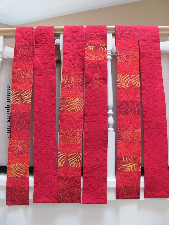
Colleen and I took on a commission to make 3 stoles for new ministers in the United Church, as gifts. The request was for red, which is the color of ordination, and for Pentecost. So, I used some Pentecost symbols in the quilting.
Our goal, with the piecing and with the quilting, was to make these stoles the same, but different.
They all got the same cross....but different. The structure of the cross was stitched twice with Glitter
The fun thing about making 3 of something is that I got to try it stitching the cross 3 different ways
I also added some doves and a Trinity symbol, swirls for the spirit, flames, and flora.
I deliberately put the main motifs at different heights on the stoles, so if they got slightly askew in the wearing, it wouldn't be immediately obvious.
There's an abundance of photos following...
I really like the effect of this overstitched Trinity symbol. I'll definitely overstitch like this again.
Stole 1
Stole 2
Stole 3
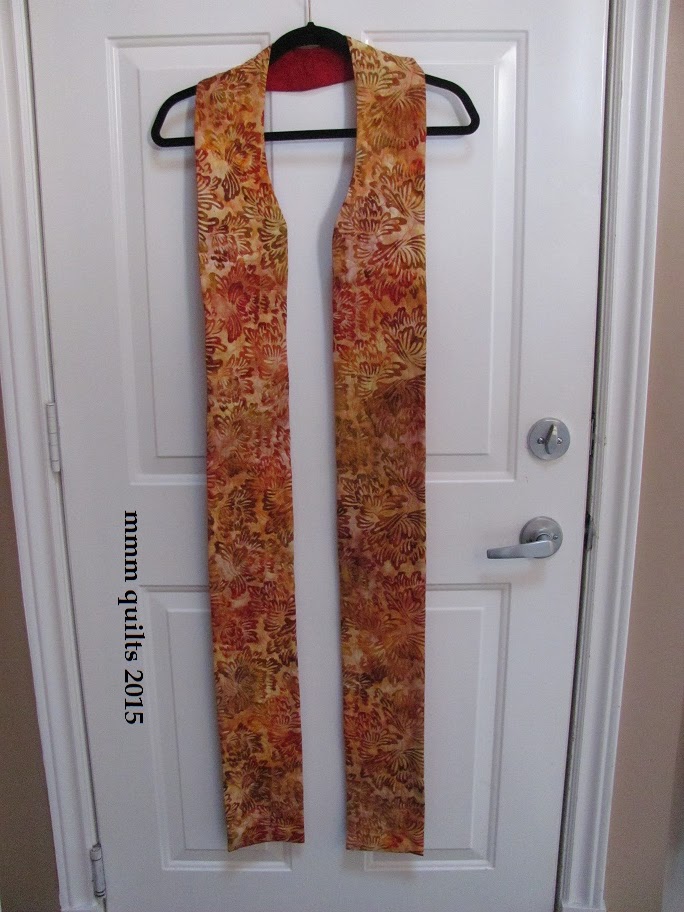
and we found a nice orange/red backing, to make it two sided, and useable for parts of the church year for which orange is the color
again, I know I took more photos of these stoles, but I cannot find them, so I decided I'd quit waiting for them to appear and post what I had.
Subscribe to:
Posts (Atom)